The Brief
A broad lighting range needs to communicate technical features at a glance while keeping the product visible and the ATAK identity consistent across formats.

A packaging language for portable lighting

A broad lighting range needs to communicate technical features at a glance while keeping the product visible and the ATAK identity consistent across formats.
A black field, yellow accents, large product names and compact feature modules. The same structure works on boxes and hanging cards.
From small clip lights to larger rechargeable lights, the hierarchy scales with the package while specs stay in the same place.
Full front and back artwork, with three details called out.
Bold type and yellow accents make the product name easy to scan.
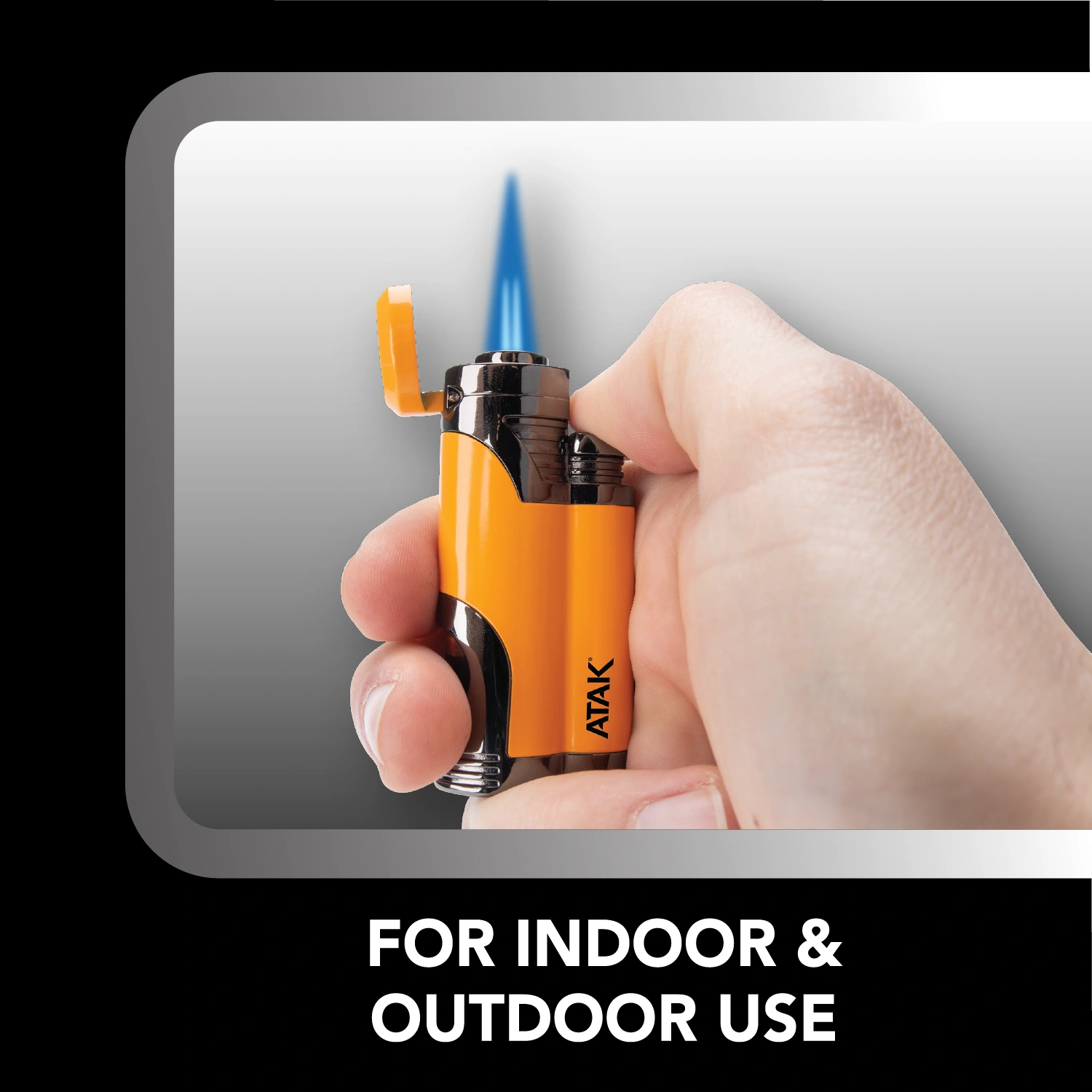
An in-use photo shows the torch lit and held in hand.

Four icons make the torch’s key features easy to scan.
More packages from the range.